| « Focusing Elements | Index | Hit Test » |
Groups
Groups allow items to be organized into subsets.
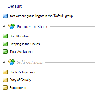
Depending on the view, groups can be oriented vertically or horizontally. Following screenshot shows items organized into groups:

Setting Up Groups
By default, groups are not visible and there is only one default group with all the items.
Setting-up groups is very simple. Just set the ShowGroups property to true.
Adding and managing custom groups can be done through Groups collection in the same manner as when managing columns and items.
The last step when setting-up groups is to put items into their groups. This can be done either by setting group on BetterListViewItem instance:
C#
item.Group = group;Visual Basic
item.Group = groupor by adding the item into BetterListViewGroup.Items collection:
C#
group.Items.Add(item);Visual Basic
group.Items.Add(item)We chose to use the similar data model for groups as used in the regular .NET ListView, so the usage is virtually the same. The only difference is that Better ListView keeps order of items within groups. Even thought we adopt the .NET ListView model, it would be convenient to pinpoint important aspects of groups:
-
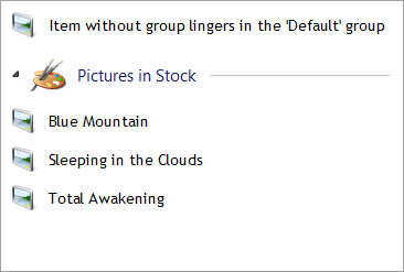
Items without group are displayed in default group.
-
The default group is just a placeholder for items and not intented to be edited; simply create a custom group for such purpose.
-
BetterListViewGroup.Items collection can contain items that are not part of the current control - only items that are part of both the control and the group within that control are displayed.
Selecting Groups
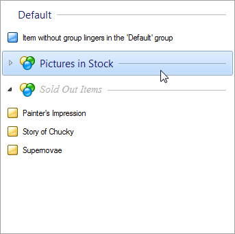
Only items contribute to selections in ListView. However, groups are interactive and support item selections. When a group is collapsed (left image), it behaves like item. Such group can be selected by keyboard, by clicking on it or even with mouse drag selection. When a group is expanded (right image), it does not appear as selected, but in both cases the group "selection" means that all items within that group are selected.
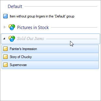
Groups can be focused just like items. When a group is focused, a focus rectangle appears on the group and the currently focused group can be retrieved by FocusedGroup property.
Adjusting Group Header Behavior
The group headers can be focused and perform selection of items with both keyboard and mouse. This behavior can be altered using GroupHeaderBehavior property, which is a flag enumeration with following values:
-
None
-
The group header is only displayed, not interactive.
-
-
KeyboardFocus
-
The group header can be focused with keyboard.
-
-
KeyboardSelectAndFocus
-
The group header can be focused and provides selection of items width keyboard. This value implicates KeyboardFocus.
-
-
MouseFocus
-
The group header can be focused with mouse.
-
-
MouseHighlight
-
The group header is highlighted when mouse cursor hovers over it.
-
-
MouseSelect
-
The group header provides selection of items with mouse.
-
-
All
-
The group header is fully interactive (all the options above are active).
-
Expandable Groups
In all views except List, the groups are oriented vertically and can be collapsed and expanded through expand button.
Groups are expandable by default, but expand buttons can be turned off by settings ShowGroupExpandButtons to false. If you want to hide expand button on selected groups only, set BetterListViewGroup.AllowShowExpandButton to false.
Group can be expanded or collapsed programmatically using BetterListViewGroup.IsExpanded property.
Hiding the Default Group Header
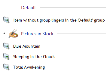
The default group header is visible by default, but can be hidden by setting ShowDefaultGroupHeader property to false:
Getting Visible Groups Only
Some groups may be scrolled out of view. If you need to iterate through the visible groups only, use the VisibleGroups property. The property getter returns collection which is re-created whenever the visibility of groups changes.
Sample Source Code
C#
//
// create first group
//
BetterListViewGroup groupUnread = new BetterListViewGroup("Unread Messages");

// add items to the first group
groupUnread.Items.AddRange(
    new[]
    {
        "Hello, Dave",
        "Suggestion about your software",
        "You won the 1st prize!"
    });

//
// create second group
//
BetterListViewGroup groupRead = new BetterListViewGroup("Read Messages");

// add items to the second group
groupRead.Items.AddRange(
    new[]
    {
        "Weekly meeting in a pub",
        "You won the 1st prize!"
    });

//
// create third group
//
BetterListViewGroup groupConcepts = new BetterListViewGroup("Concepts");

// setup style of the first group
groupConcepts.Font = new Font(
    "Arial",
    groupConcepts.Font.Size,
    FontStyle.Italic);

groupConcepts.ForeColor = Color.Gray;

// add items to the third group
groupConcepts.Items.AddRange(
    new[]
    {
        "How are you, Pete?"
    });

//
// setup Better ListView
//
this.listView.BeginUpdate();

// add groups with items to the list
this.listView.Groups.AddRange(
    new[]
    {
        groupUnread,
        groupRead,
        groupConcepts
    });

// size items with the content area (optional)
this.listView.AutoSizeItemsInDetailsView = true;
// show not only items, but the groups as well
this.listView.ShowGroups = true;

this.listView.EndUpdate();
Visual Basic
'
' create first group
'
Dim groupUnread As New BetterListViewGroup ("Unread Messages")

' add items to the first group
groupUnread.Items.AddRange (New String() _
                               {"Hello, Dave", "Suggestion about your software", "You won the 1st prize!"})

'
' create second group
'
Dim groupRead As New BetterListViewGroup ("Read Messages")

' add items to the second group
groupRead.Items.AddRange (New String() {"Weekly meeting in a pub", "You won the 1st prize!"})

'
' create third group
'
Dim groupConcepts As New BetterListViewGroup ("Concepts")

' setup style of the first group
groupConcepts.Font = New Font ("Arial", groupConcepts.Font.Size, FontStyle.Italic)

groupConcepts.ForeColor = Color.Gray

' add items to the third group
groupConcepts.Items.AddRange (New String() {"How are you, Pete?"})

'
' setup Better ListView
'
ListView.BeginUpdate()

' add groups with items to the list
ListView.Groups.AddRange (New BetterListViewGroup() {groupUnread, groupRead, groupConcepts})

' size items with the content area (optional)
ListView.AutoSizeItemsInDetailsView = True
' show not only items, but the groups as well
ListView.ShowGroups = True

ListView.EndUpdate()| « Focusing Elements | Index | Hit Test » |
| Better Thumbnail Browser Documentation | Copyright © 2010-2012 ComponentOwl.com |
